20 June 2020
Assists in producing a plot that more effectively expresses changes over time for two different types(Long format and Wide format) using a consistent calling scheme for longitudinal data. It provides the ability to projection supplementary information (supplementary objects and variables) that can often occur in longitudinal data to graphs, as well as provides a new interactive implementation to perform the additional interpretation, so it is also useful for longitudinal data visuals analysis. (see http://lib.pusan.ac.kr/resource/e-article/?app=eds&mod=detail&record_id=edsker.000004649097&db_id=edsker for more information).
You can install the released version of vlda from CRAN with:
And the development version from GitHub with:
This is a basic example which shows you how to solve a common problem:
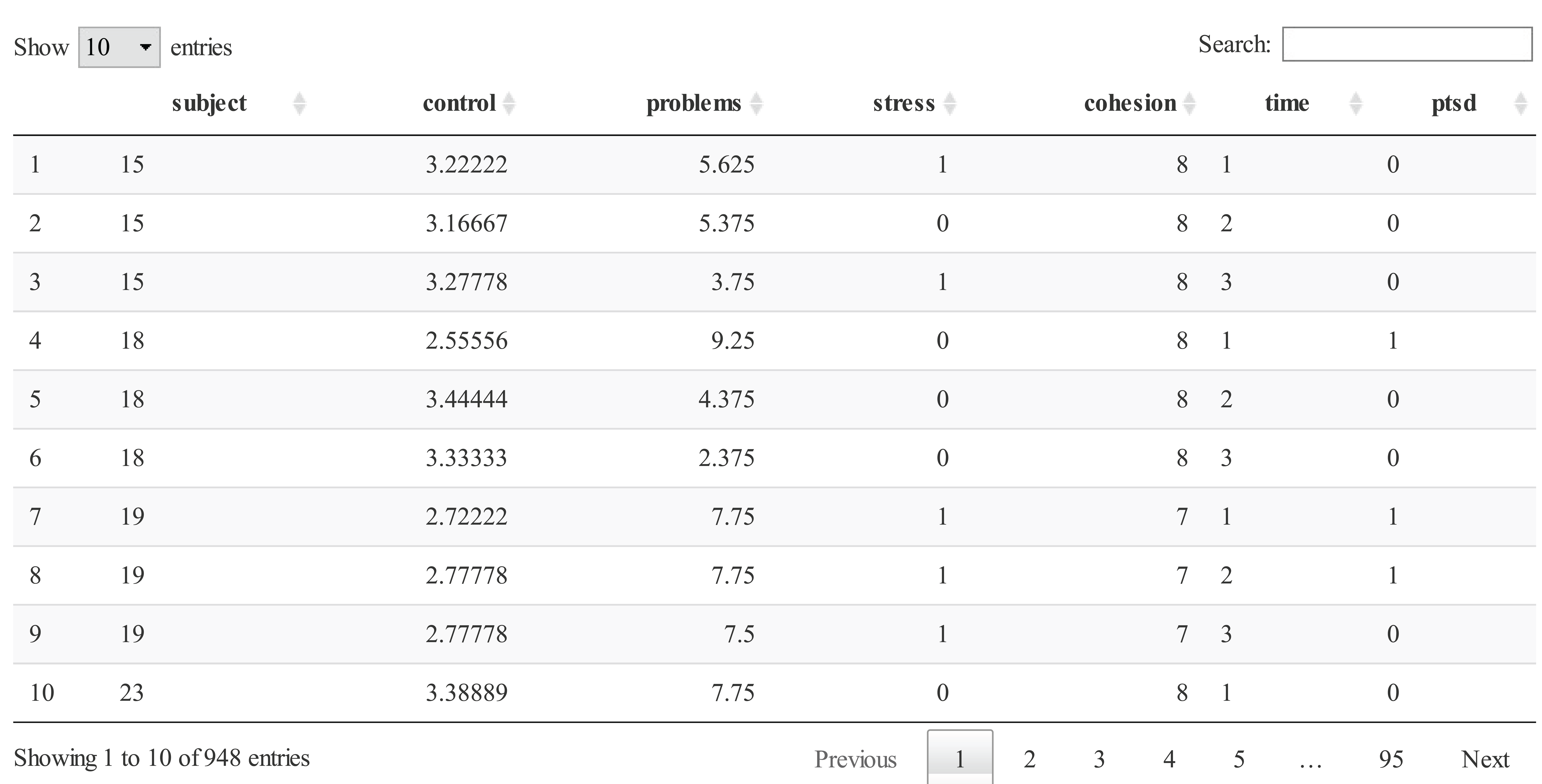
This data was measured on 316 patients who survived the fire at 3, 6, and 12 months after the fire (i.e., each row contains one time point per object and each patient has three rows). The dataset consists of the outcome variable (PTSD; Yes or No) and four different variables with either real or integer values as follow: Control (self-control), Problems (the number of life problems), Stress (the number of stress events), and Cohesion (family cohesion). Here we focus on PTSD levels, which is considered one of the most important ones associated with post-traumatic stress disorder progression.

PTSD[,2:4] <- apply(PTSD[,2:4], 2, function(x) ifelse(x >= 3, 1, 0))
PTSD[,5] <-  ifelse(PTSD[,5] >= 6 , 1, 0)
PTSD <- data.frame(lapply(PTSD, function(x) as.factor(x)))
str(PTSD)
#> 'data.frame':    948 obs. of  7 variables:
#>  $ subject : Factor w/ 316 levels "15","18","19",..: 1 1 1 2 2 2 3 3 3 4 ...
#>  $ control : Factor w/ 2 levels "0","1": 2 2 2 1 2 2 1 1 1 2 ...
#>  $ problems: Factor w/ 2 levels "0","1": 2 2 2 2 2 1 2 2 2 2 ...
#>  $ stress  : Factor w/ 2 levels "0","1": 1 1 1 1 1 1 1 1 1 1 ...
#>  $ cohesion: Factor w/ 2 levels "0","1": 2 2 2 2 2 2 2 2 2 2 ...
#>  $ time    : Factor w/ 3 levels "1","2","3": 1 2 3 1 2 3 1 2 3 1 ...
#>  $ ptsd    : Factor w/ 2 levels "0","1": 1 1 1 2 1 1 2 2 1 1 ...
fit <- vlda(x = PTSD, object = "subject", time = "time", type = "long")
fit
#> $obs.coordinate
#> # A tibble: 57 x 3
#> # Groups:   x [57]
#>         x      y obs_list
#>     <dbl>  <dbl> <named list>
#>  1 -1.49  -1.20  <chr [2]>
#>  2 -1.26  -0.283 <chr [21]>
#>  3 -1.03  -1.14  <chr [5]>
#>  4 -1.03  -1.01  <chr [1]>
#>  5 -1.02  -0.379 <chr [13]>
#>  6 -0.92   0.233 <chr [30]>
#>  7 -0.916 -0.784 <chr [2]>
#>  8 -0.858 -0.808 <chr [4]>
#>  9 -0.801 -0.215 <chr [11]>
#> 10 -0.799 -0.088 <chr [7]>
#> # ... with 47 more rows
#>
#> $var.coordinate
#>                 x      y
#> control.0  -2.215 -0.326
#> control.1   0.530  0.078
#> problems.0  2.549 -1.702
#> problems.1 -0.589  0.393
#> stress.0    0.081  0.326
#> stress.1   -1.292 -5.200
#> cohesion.0 -1.658 -2.528
#> cohesion.1  0.373  0.568
#> time.1     -1.270  1.243
#> time.2      0.132  0.667
#> time.3      1.138 -1.910
#> ptsd.0      0.855  0.362
#> ptsd.1     -1.902 -0.805
#>
#> $Eigen
#>   Eigenvalue Percent Cumulative
#> 1      0.289  24.8 %     24.8 %
#> 2      0.184  15.8 %     40.6 %
#> 3      0.169  14.5 %     55.1 %
#> 4      0.165  14.1 %     69.2 %
#> 5      0.133  11.4 %     80.6 %
#> 6      0.116   9.9 %     90.5 %
#> 7      0.110   9.5 %      100 %
#>
#> $GOF
#> [1] "Goodness of fit : 40.6 %"
As a result of vlda, obs.coordinates, var.coordinates, Eigen, and GOF are returned. obs.coordinate and var.coordinate represent the row and column coordinates, respectively, in step 4 of the VLDA plot algorithm. obs.coordinate represents the unique coordinates for the 948() rows. This appeared as many as the number of combinations of categories for each variable, and the observations corresponding to each row are included in the obs_list variable in the form “observation_timepoint”. For example, the observations for the first row coordinates “x = -1.49, y = -1.20” are:
This means that patients 127 and 350 are located at that coordinate 3 months after the fire. Eigen summarizes the principal inertias as a result of applying the VLDA plot using the indicator matrix. The number of non-zero principal inertias is from the total number of categories minus the number of categorical variables. GOF appears goodness-of-fit of two-dimensional VLDA plot. Now create a two-dimensional VLDA plot using the vlda_plot function. This function accepts the value returned by vlda as the main argument. To do so, the following code is used:
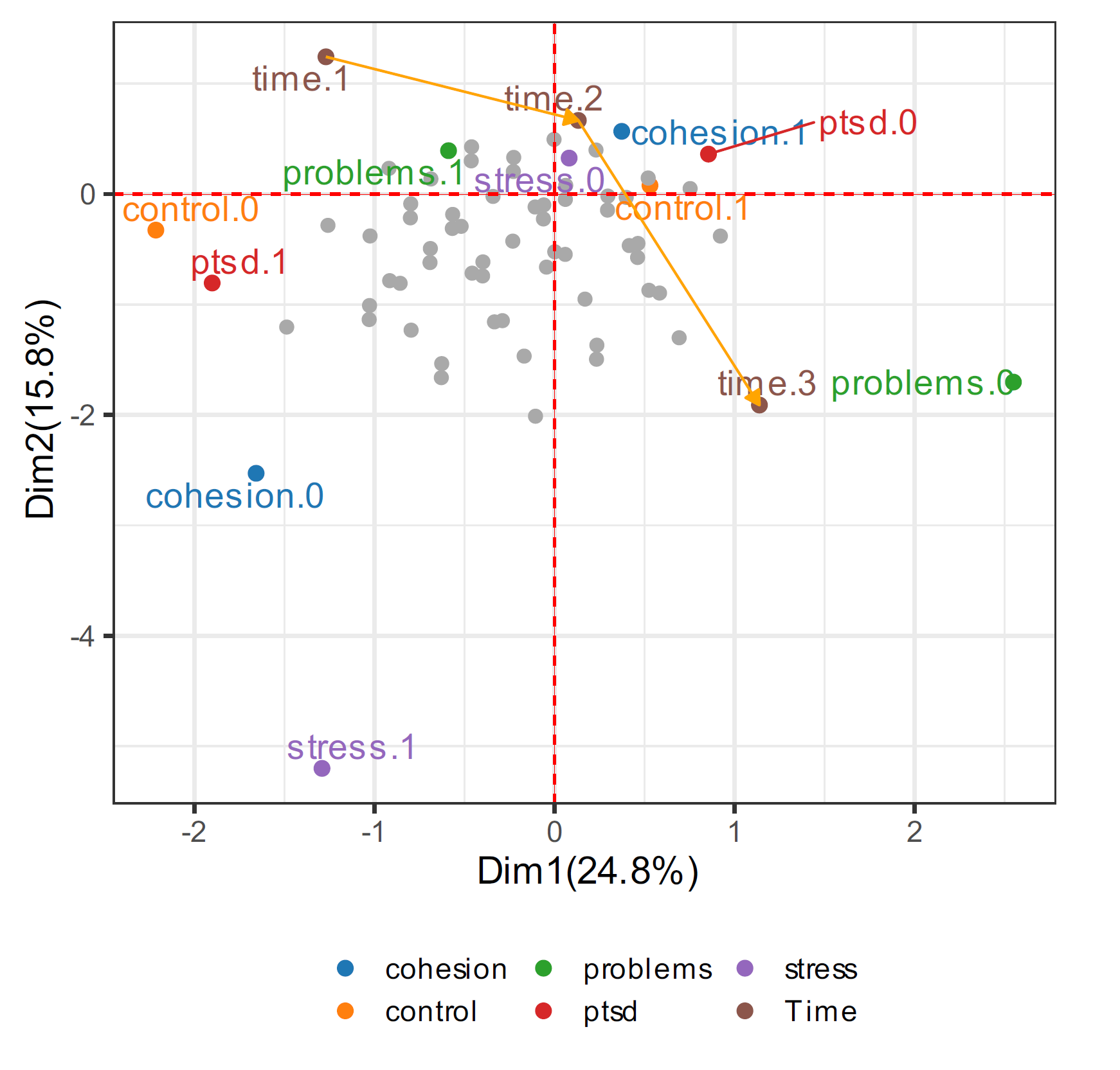
Figure 4.1. VLDA plot of PTSD data applying the vlda. ● control (control.0 and control.1), problems (problems.0 and problems.1), stress (stress.0 and stress.1), and cohesion (cohesion.0 and cohesion.1), where 0 and 1 denote low and high respectively. ● Time, where time.1, time.2, and time.3 denote 3, 6, and 12 months respectively. ● PTSD, where ptsd.0 denotes that PTSD does not appear, and ptsd.1 denotes that PTSD appears.
In Figure 4.1, a total of 948 rows for 316 objects are grayed out at three time points. Gray dots indicate the number of category combinations each variable can have. This means each row of obs.coordinate. The vlda_plot function is implemented as an interactive graphics by default. This interactive figure can be displayed in RStudio’s viewer pane. The viewer pane is an interactive version with tooltips and hover effects for performing additional analysis. Tooltip shows that allows user to see the time point and the observations associated with that coordinate when mouse over the coordinates. It is a function that can visually display the above-mentioned obs_list without any special call in the graph as well as the ability to visually distinguish to observations of specific coordinates. Another feature, the hover effect, is displayed in yellow at coordinates that have the same time point as the coordinates when hovering over the coordinates. This can be used to understand trends in observations over time in addition to identifying relative relationships at a simple visualization level. Thanks to the synergistic relationship between the existing VLDA plot and interactive features, the user is empowered by a refined observe the visual aspects of the VLDA plot layout. In the VLDA plot, each variable is divided into different colors, and each category included in the variable is displayed in the same color. The default passed to the color argument in vlda is the D3 palette, which offers a sequential color palette, offering a good balance of these properties well. Users can set the interactive argument to FALSE to change it to an ideal palette and theme. A helpful divergent palette and theme available in the package is the ggsci and ggplot2 package, respectively.
Now, we explain the geometric interpretation of the VLDA plot. Coordinates in opposite directions on each axis can be considered to be different groups. And if the distance between the coordinates is close, it indicates that the group has a similar tendency. Even if the explanatory variable is not significant, a small tendency can be confirmed because the coordinate is placed in consideration of the relative influence. As shown in Figure 4.1, it shows that control.0, problem.1, stress.1, cohesion.0, time.1, and ptsd.1 are placed on the left side of the first axis, showing their homogeneity. This indicates that patients have low self-control and family cohesion, and a lot of life problems and stress events caused PTSD after 3 months. In contrast, control.1, problem.0, stress.0, cohesion.1, time.2, time.3, and ptsd.0 are placed on the right side of the first axis. Therefore, PTSD did not appear after 6-12 months because patients have high self-control and family cohesion, and fewer life problems and stress events.
Next, we can consider supplementary data, the longitudinal data inevitably has the characteristic that supplementary data is added. PTSD_row is control, problems, stress, cohesion, and ptsd can add as the rows, for 316 patients after 18 months. and PTSD_column is the degree of drinking (Low, High) that may affect PTSD, can add to the columns correspond first to third time point for 316 patients.
data(PTSD_row)
data(PTSD_column)
str(PTSD_row)
#> 'data.frame':    316 obs. of  13 variables:
#>  $ control.0 : int  0 0 0 0 0 0 0 0 0 0 ...
#>  $ control.1 : int  1 1 1 1 1 1 1 1 1 1 ...
#>  $ problems.0: int  1 1 1 1 1 1 1 1 0 1 ...
#>  $ problems.1: int  0 0 0 0 0 0 0 0 1 0 ...
#>  $ stress.0  : int  1 1 1 1 1 1 1 1 1 1 ...
#>  $ stress.1  : int  0 0 0 0 0 0 0 0 0 0 ...
#>  $ cohesion.0: int  0 0 0 0 0 0 0 0 0 0 ...
#>  $ cohesion.1: int  1 1 1 1 1 1 1 1 1 1 ...
#>  $ time.1    : int  0 0 0 0 0 0 0 0 0 0 ...
#>  $ time.2    : int  0 0 0 0 0 0 0 0 0 0 ...
#>  $ time.3    : int  0 0 0 0 0 0 0 0 0 0 ...
#>  $ ptsd.0    : int  1 1 1 1 1 1 1 1 1 1 ...
#>  $ ptsd.1    : int  0 0 0 0 0 0 0 0 0 0 ...
fit2 <- vlda_add(fit, add.row = PTSD_row, add.col = PTSD_column)
vlda_plot(fit2)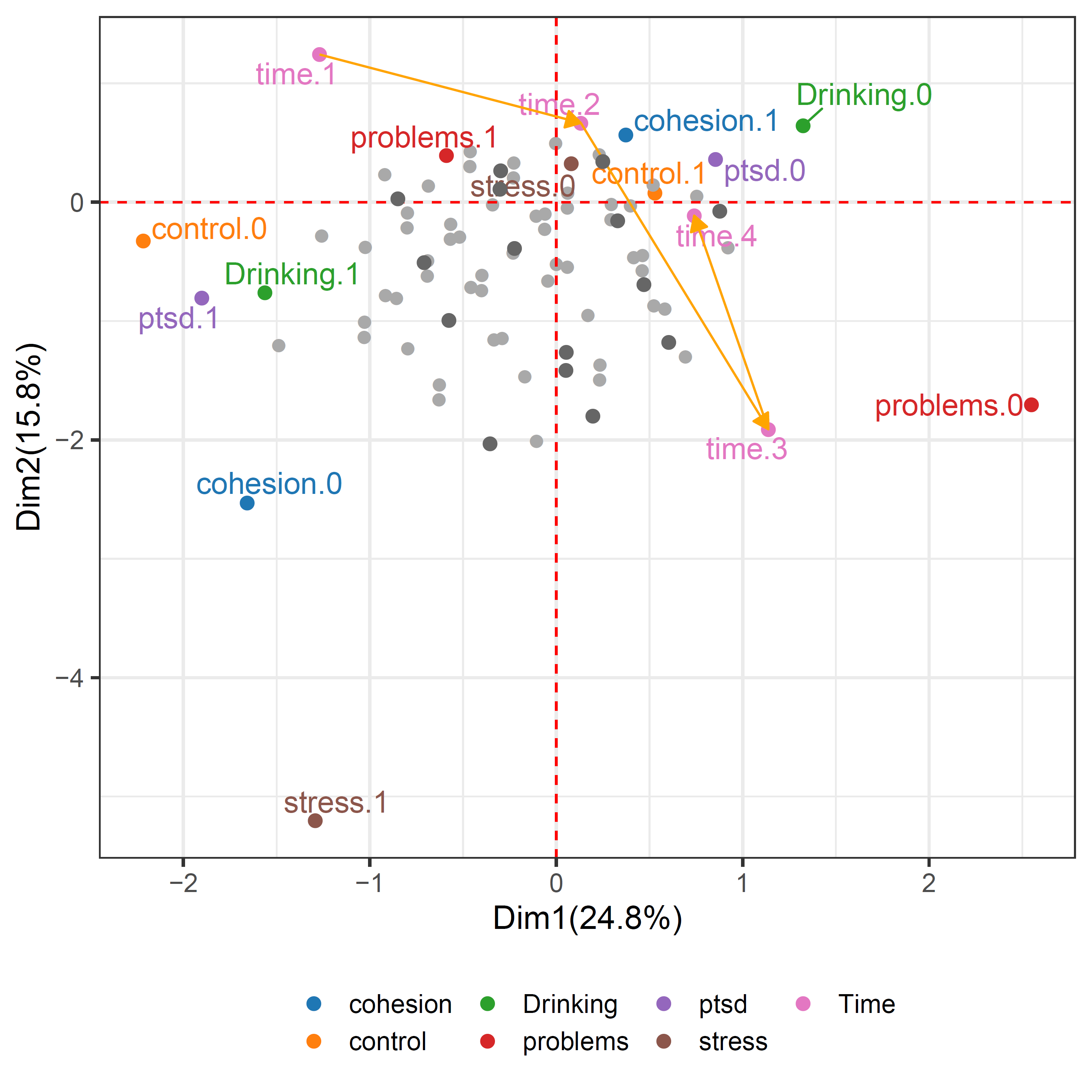
Figure 4.5. Coordinates for supplementary objects and variables added to Figure 4.1. ● control (control.0 and control.1), problems (problems.0 and problems.1), stress (stress.0 and stress.1), cohesion (cohesion.0 and cohesion.1), and Drinking (Drinking.0 and Drinking.1), where 0 and 1 denote low and high respectively. ● Time, where time.1, time.2, time.3, and time.4 denote 3, 6, 12, and 18 months respectively. ● PTSD, where ptsd.0 denotes that PTSD does not appear, and ptsd.1 denotes that PTSD appears.
Figure 4.5 shows that in the VLDA plot, a drinking column parameter added, and a supplementary coordinates for 316 patients of the fourth time point were added. In the supplementary data, the number of categorical combinations of each variable has a total of 15 possible combinations for the added fourth time point of the existing 316 patients. So, in Figure 4.5 shows 15 supplementary coordinates in dark grey. The center of the supplementary coordinates is placed on the right side of the first axis. Also, we can see that it gets closer to ptsd.0 at the fourth time point than at the third time point. That is, also after 18 months, we can know that more decrease over time the ratio of PTSD, the same interpretation can be made after 6-12 months. Drinking.1 is located on the left side of the first axis, showing homogeneity with control.0, problems.1, stress.1, cohesion.0, time.1, and ptsd.1. This indicates that patients have low self-control and family cohesion, and a lot of life problems and stress events, as well as heavy drinking, caused PTSD after 3 months. On the contrary, drinking.0 is located on the right side, showing the similarities with control.1, problems.0, stress.0, cohesion.1, time.2, time.3 and ptsd.0. In other words, after 6-12 months, self-control and family cohesion were increased, and the number of life problems and stress events were decreased, as well as drinking decreased, to show that PTSD did not appear.
Depression data compare two drugs to treat patients suffering from depression. This data has modified some of the data collected by Koch et al. (1977). According to the initial severity of depression, a total of 800 patients were assigned into two groups, mild or severe. In each group, patients were randomly assigned to either standard or new drugs. After 1 week, 2 weeks, and 4 weeks of treatment, the degree of depression in each patient was classified as normal or abnormal.
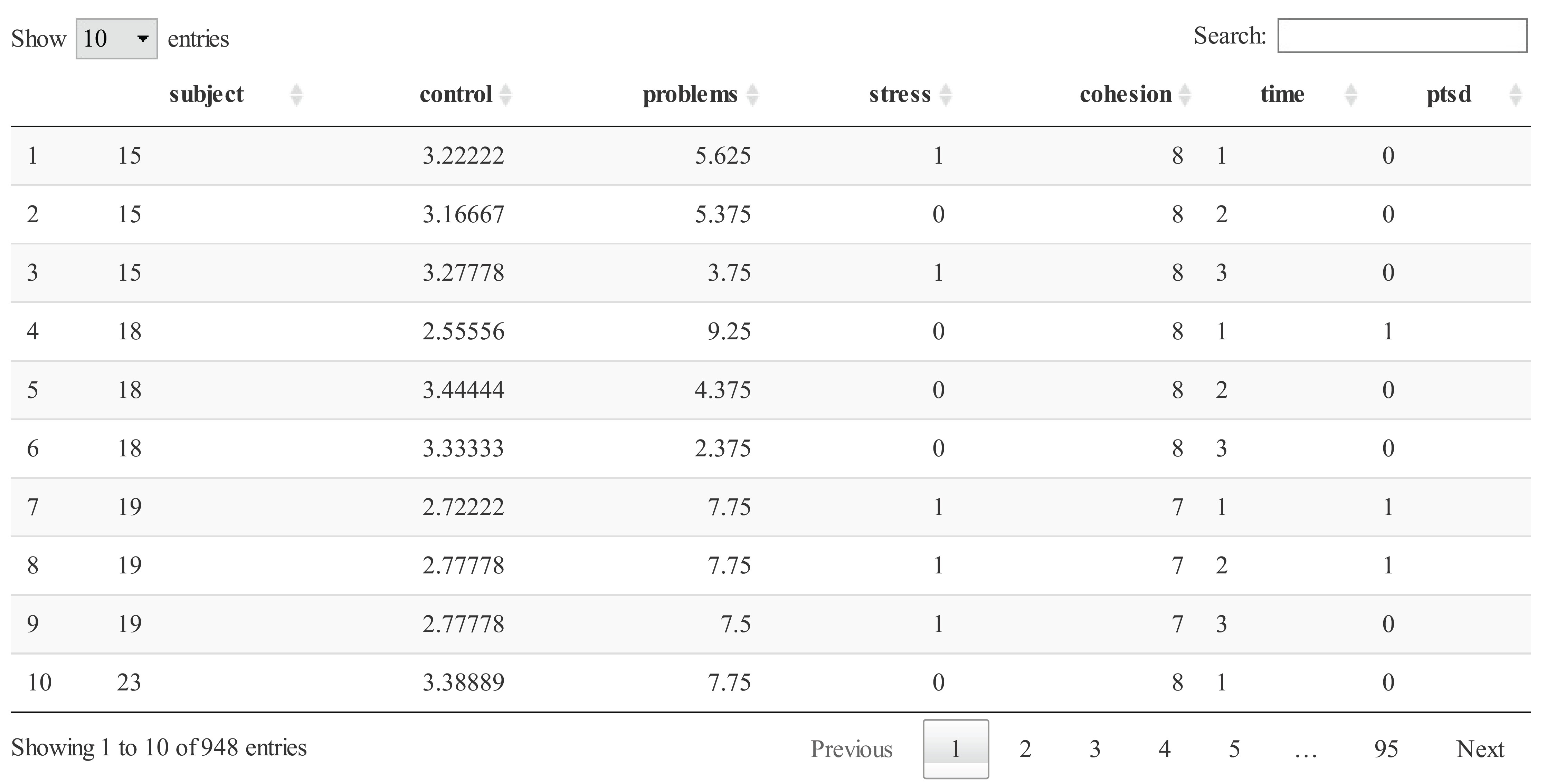
str(Depression)
#> 'data.frame':    800 obs. of  6 variables:
#>  $ Case     : Factor w/ 800 levels "1","10","100",..: 1 112 223 334 445 556 667 778 790 2 ...
#>  $ Diagnosis: Factor w/ 2 levels "1","2": 1 1 1 1 1 1 1 1 1 1 ...
#>  $ Drug     : Factor w/ 2 levels "1","2": 2 2 2 2 2 2 2 2 2 2 ...
#>  $ 1week    : Factor w/ 2 levels "1","2": 2 2 2 2 2 2 2 2 2 2 ...
#>  $ 2weeks   : Factor w/ 2 levels "1","2": 2 2 2 2 2 2 2 2 2 2 ...
#>  $ 4weeks   : Factor w/ 2 levels "1","2": 2 2 2 2 2 2 2 2 2 2 ...
wide.fit <- vlda(x = Depression, object = "Case", time = c("1week", "2weeks", "4weeks"), type = "wide")
vlda_plot(wide.fit)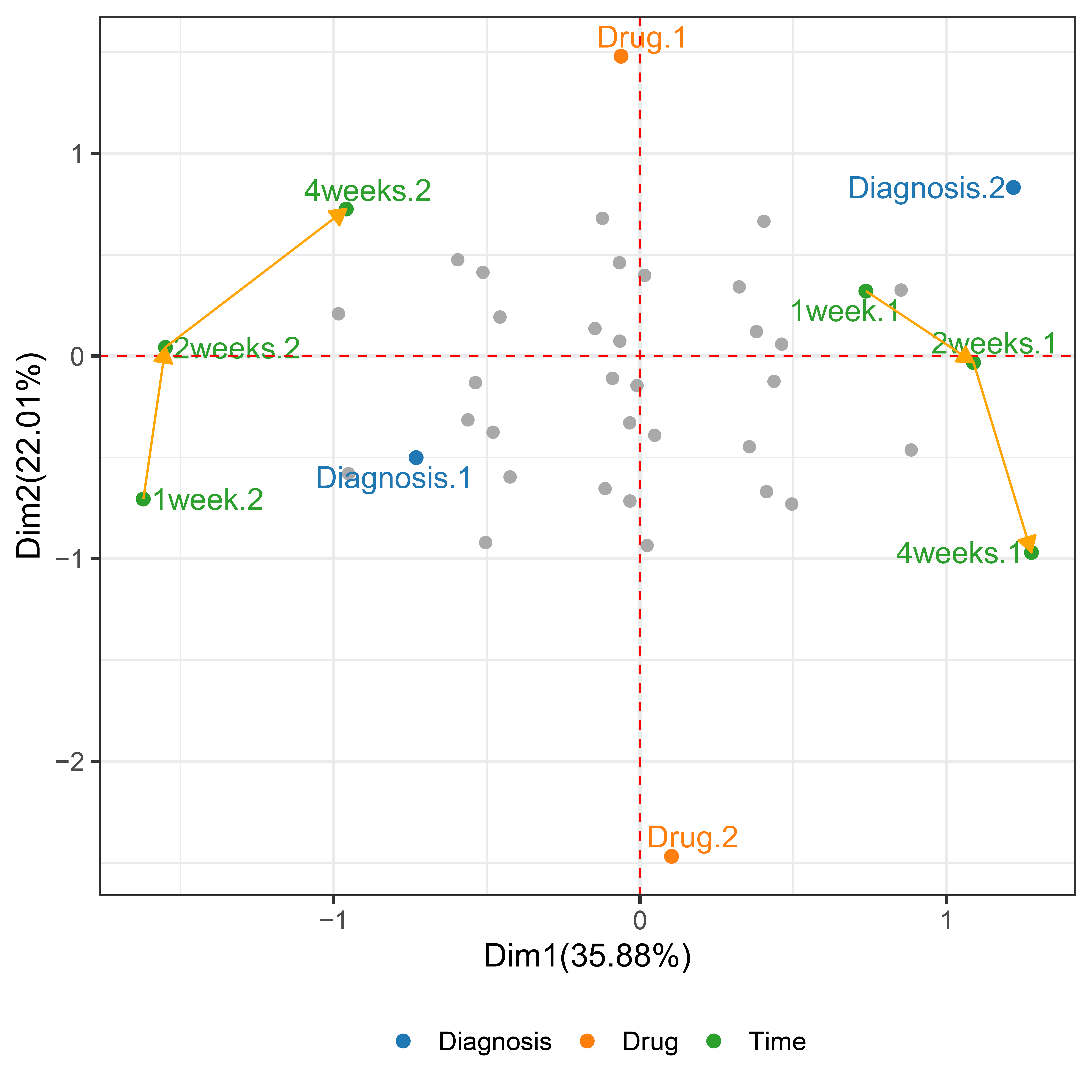
Figure 4.6. VLDA plot of depression data. ● Diagnoses (Diagnosis.1 and Diagnosis.2), where 1 and 2 denote Mild and Severe, respectively). ● Drugs (Drug.1 and Drug.2), where 1 and 2 denote Standard drug and New drug, respectively). ● Outcomes at each time point, where 1week.1, 2week.1, and 4week.1 denote Abnormal at 1, 2, and 4 weeks respectively, and 1week.2, 2week.2, and 4week.2 denote Normal at 1, 2, and 4 weeks respectively.
We focus on drug levels, which is considered one of the most important treatments associated with the depression. The main question of this trial is whether or not the active treatment new drug group reveals a significantly better effect treatment degree of depression than the standard group. Therefore, we will consider that see if the depression according to the initial depression and drug levels effects drug treatment over time. In the call to vlda() argument time accepts the 1week, 2weeks, and 4weeks, that a character string that denotes the name of the time variable. In the Depression data, the number of categorical combinations for each variable for 800 objects has a total of 32 unique possible combinations, and 32 observed coordinate points are grayed out. The yellow arrows that were connected between the same categories denote the trend of changes over time. In Figure 4.6, Drug.1, Diagnosis.1, and Normal (1week.2, 2week.2, and 4weeks.2) are placed on the left side of the first axis, indicating their homogeneity. For example, patient 201 has the values of 1 in Mild (Diagnosis.1), new drug (Drug.1), Normal (1week.2, 2weeks.2, and 4weeks.2), so it placed in the second quadrant.
In contrast, Drug.2, Diagnosis.2, and Abnormal (1week.1, 2weeks.1, and 4weeks.1) are placed on the right side of the first axis. For example, patient 600 has the values of 1 in Severe (Diagnosis.2), standard drug (Drug.2), Abnormal (1week.1, 2weeks.1, and 4weeks.1), so it placed in the fourth quadrant.
Therefore, patients who take a new drug (Drug.1) and mild initial depression (Diagnosis.1) are more likely to be normal, and patients who take a standard drug (Drug.2) and severe initial depression (Diagnosis.2) are more likely to be abnormal. Also, regardless of the drug taken after 1 week, mild (Diagnosis.1) is close to normal (1week.2) and severe (Diagnosis.2) is close to abnormal (1week.1). This means that there is no effect of the drug after 1 week. However, as time passes, the normal (1week.2 → 2weeks.2 → 4weeks.2) approaches the new drug (Drug.1) and the abnormal (1week.1 → 2week.1 → 4week.1) approaches the standard drug (Drug.2). That is, the effect of the drugs appears over time. In this way, it is possible to relate variables and objects, and to cluster objects by utilizing objects information. Also, the VLDA plot shows that it is more suitable for the visualization of longitudinal data by dynamically showing the trend of change over time, unlike the existing visualization techniques of categorical data.
In the case of long-form, coordinate having the same time point are filled with the yellow color on the graph, to make it easier to distinguish the patients at the same time points with colors. However, in the case of wide form, when the mouse over the observation coordinate points, the graph shows the hover effect in which the coordinate points of observations with the same covariate are displayed in yellow points on the graph. For example, observations with a covariate of Diagnosis.1 and Drug.1 appear as the graph in the upper left. In this graph, the observations on the right side of the first axis appear abnormal for all three time points, and the more they go to the left, the more normal they appear. Conversely, observations with covariates Diagnosis.2 and Drug.2 appears in the graph in the lower right, the observations on the left side of the first axis appear normal for all three time point, and the more they go to the right, the abnormal more appear. That is, It is possible to visually check how much observation points according to the covariate, are close to response variables. Next, we can consider applying to the additional measured objects and variables to Depression data. In Depression_row data supplementary objects represent 100 patients taking placebo instead of standard and new drugs in each mild and severe group. These supplementary objects are added as rows to depression data. Depression_column data consists of the response at the fourth time point (after 6 weeks) to 800 patients and the gender that can affect depression. This data is added as columns to depression data.
Depression_row <- as.matrix(Depression_row)
Depression_column <- as.matrix(Depression_column)
wide.fit2 <- vlda_add(wide.fit, time.name = "6weeks", add.row = Depression_row, add.col = Depression_column)
rownames(wide.fit2$var.coordinate)
#>  [1] "1week.1"     "1week.2"     "2weeks.1"    "2weeks.2"    "4weeks.1"    "4weeks.2"    "6weeks.1"    "6weeks.2"    "Diagnosis.1"
#> [10] "Diagnosis.2" "Drug.1"      "Drug.2"      "Drug.3"      "sex.1"       "sex.2"
vlda_plot(
  wide.fit2,
  rename = c(
    "1week.Ab", "1week.N",
    "2weeks.Ab", "2weeks.N",
    "4weeks.Ab", "4weeks.N",
    "6weeks.Ab", "6weeks.N",
    "Mild", "Severe",
    "New", "Standard","Placebo",
    "Male","Female"),
  title = "Depression data", title.col = "#555555", title.size = 25,
  subtitle = "Supplementary objects and variables added",
  sub.size = 15, sub.col = "darkgrey",
  legend.position = c(0.15, 0.15)
)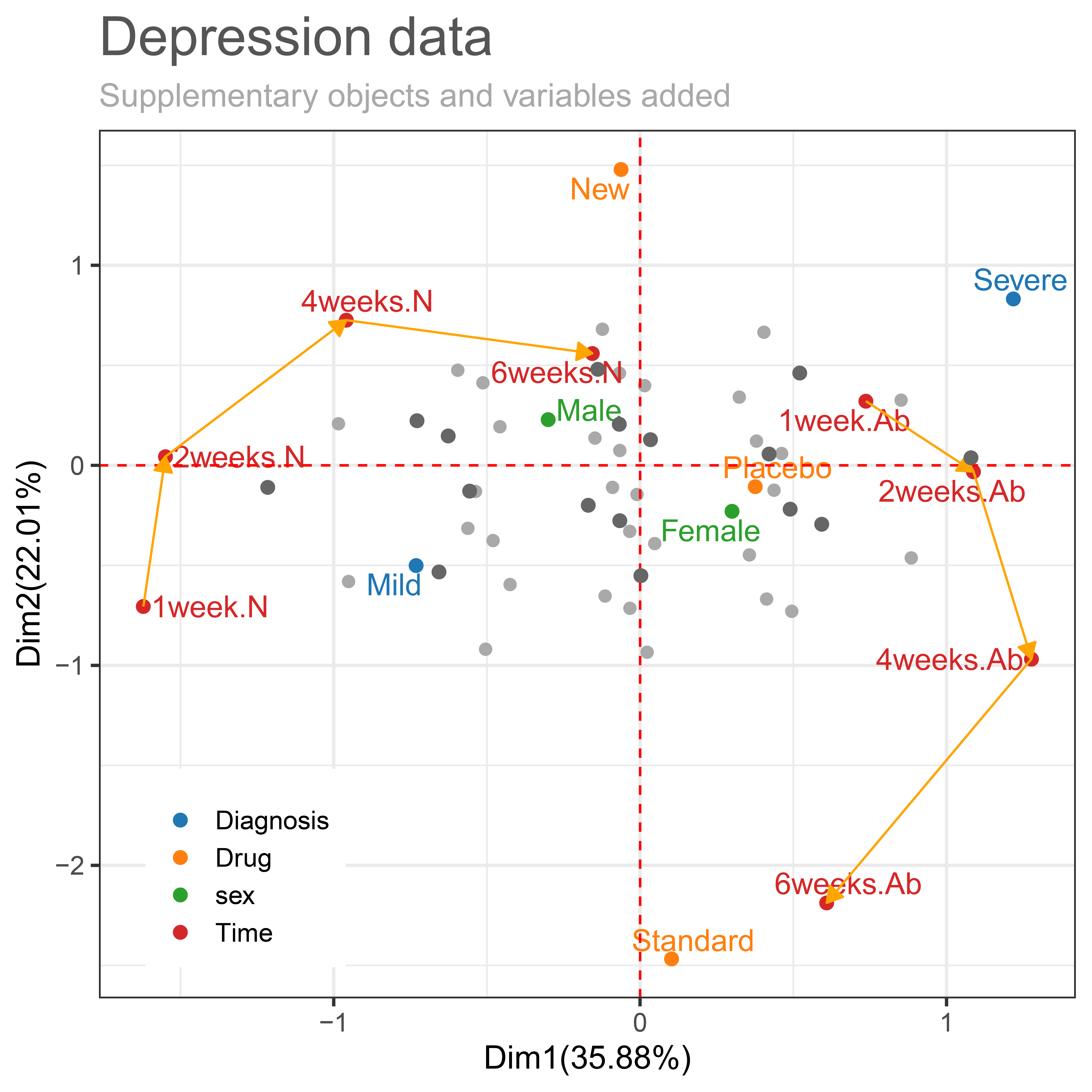
Figure 4.8. Coordinates for supplementary objects and variables added to Figure 4.6.
Figure 4.8 shows an additional representation of coordinates to the already provided VLDA plot in Figure 4.6. It is showing that sex and fourth-time point (after 6weeks) as columns parameter for 800 patients added by the Depression_row data. The supplementary coordinates 100 patients taking placebo were added by the supplementary row indicator matrix. The number of categorical combinations of each variable had a total of 16 possible combinations for 100 patients taking placebo. So, in Figure 4.8 show 16 supplementary coordinates in dark grey. The add.obs.col argument allows the user to specify the color of the supplementary coordinates (default = “dark grays”). If add.obs.col = “equal”, it is output in the same color as the color specified by the user in the obs.col argument. The color argument used in the package can be specified as a hex codes (eg: title.col = “#555555”) or a string (eg: sub.col = “darkgray”). The legend.postition argument is to adjust the position of legends. The position of the legend can be specified by the character string “none”, “left”, “right”, “bottom”, “top”, or a numeric vector of both elements (default = “bottom”).
In the supplemental data added by the column indicator matrix, fourth time point (after 6weeks) is as time passes from 4 weeks to 6 weeks, the normal (4weeks.N → 6weeks.N) becomes closer to the new drug, and abnormal (4weeks.Ab → 6weeks.Ab) becomes closer to the standard drug. That is, the effect of drugs still increases over time. This can also be confirmed in Table 4.2. Table 4.2 is shown that the normal response proportion at the fourth time point (after 6 weeks) by combinations of diagnosis and drug. The drug effect according to diagnosis shows that 6 weeks more normal proportion increased than after 4 weeks. Also we can see the new drug is more effective than standard drug, and mild is more effective than severe.
Next, we can consider combination to sex and fourth time point added by the supplementary column indicator matrix. Normal at the fourth time point (6weeks.N) and Male on the left side of the first axis, showing homogeneity with New drug, Mild, and Normal (1week.2, 2weeks.2, and 4weeks.2). On the contrary, abnormal at the fourth time point (6weeks.Ab) and Female on the right side of the first axis, showing homogeneity with Standard, Severe, and Abnormal (1week.Ab, 2weeks.Ab, and 4weeks.Ab). Therefore, if patients take a new drug, have mild initial depression, and are a male, they are more likely to be normal. And if patients take a standard drug, have severe initial depression, and are female, they are more likely to be abnormal.