
![]()
A library for creating time-based charts, like Gantt or timelines. Possible outputs include ggplots, plotly graphs, Highcharts or data.frames. Results can be used in the RStudio viewer pane, in R Markdown documents or in Shiny apps. In the interactive outputs created by Plotly.js and Highcharts.js you can interact with the plot using mouse hover or zoom. Timelines and their components can afterwards be manipulated using ggplot::theme(), plotly_build or hc_*functions (for gg-vistime, vistime or hc_vistime, respectively). When choosing the data.frame output, you can use your own plotting engine for visualizing the graph.
If you find vistime useful, please consider supporting its development: 
Feedback welcome: sa.ra.online@posteo.de
This package vistime provides three main functions:
vistime() to produce interactive Plotly charts:timeline_data <- data.frame(event = c("Event 1", "Event 2"), start = c("2020-06-06", "2020-10-01"), end = c("2020-10-01", "2020-12-31"), group = "My Events")
vistime(timeline_data)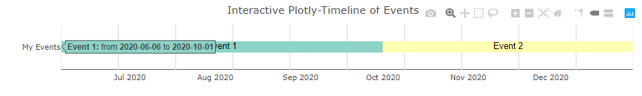
hc_vistime() to produce interactive Highcharts charts:timeline_data <- data.frame(event = c("Event 1", "Event 2"), start = c("2020-06-06", "2020-10-01"), end = c("2020-10-01", "2020-12-31"), group = "My Events")
hc_vistime(timeline_data)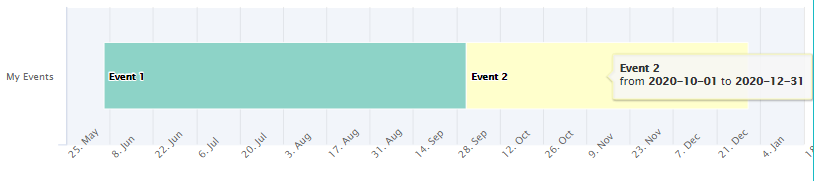
gg_vistime() to produce static ggplot output:timeline_data <- data.frame( = c("Event 1", "Event 2"), start = c("2020-06-06", "2020-10-01"), end = c("2020-10-01", "2020-12-31"), group = "My Events")
gg_vistime(timeline_data)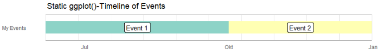
vistime_data(), for pure data.frame output that you can use with the plotting engine of your choice:timeline_data <- data.frame( = c("Event 1", "Event 2"), start = c("2020-06-06", "2020-10-01"), end = c("2020-10-01", "2020-12-31"), group = "My Events")
vistime_data(timeline_data)
#> event start end group tooltip col subplot y
#> 1 Event 1 2020-06-06 2020-10-01 My Events from <b>2020-06-06</b> to <b>2020-10-01</b> #8DD3C7 1 1
#> 2 Event 2 2020-10-01 2020-12-31 My Events from <b>2020-10-01</b> to <b>2020-12-31</b> #FFFFB3 1 1You want to use this for the intelligent y-axis assignment depending on overlapping of events (this can be disabled with optimize_y = FALSE).
To install the package from CRAN (v1.1.0), type the following in your R console:
install.packages("vistime")The simplest way to create a timeline is by providing a data frame with event and start columns. If your columns are named otherwise, you need to tell the function. You can also tweak the y positions, linewidth, title, label visibility and number of lines in the background.
vistime(data, col.event = "event", col.start = "start", col.end = "end", col.group = "group", col.color = "color",
              col.fontcolor = "fontcolor", col.tooltip = "tooltip", optimize_y = TRUE, linewidth = NULL,
              title = NULL, show_labels = TRUE, background_lines = NULL)

hc_vistime(data, col.event = "event", col.start = "start", col.end = "end", col.group = "group", col.color = "color",
           optimize_y = TRUE, title = NULL, show_labels = TRUE)

gg_vistime(data, col.event = "event", col.start = "start", col.end = "end", col.group = "group", col.color = "color",
           col.fontcolor = "fontcolor", optimize_y = TRUE, linewidth = NULL,
           title = NULL, show_labels = TRUE, background_lines = NULL)

vistime_data(data, col.event = "event", col.start = "start", col.end = "end", col.group = "group", col.color = "color",
col.fontcolor = "fontcolor", col.tooltip = "tooltip", optimize_y = TRUE)| parameter | optional? | data type | explanation |
|---|---|---|---|
| data | mandatory | data.frame | data.frame that contains the data to be visualized |
| col.event | optional | character | the column name in data that contains event names. Default: event |
| col.start | optional | character | the column name in data that contains start dates. Default: start |
| col.end | optional | character | the column name in data that contains end dates. Default: end |
| col.group | optional | character | the column name in data to be used for grouping. Default: group |
| col.color | optional | character | the column name in data that contains colors for events. Default: color, if not present, colors are chosen via RColorBrewer. |
| col.fontcolor | optional | character | the column name in data that contains the font color for event labels. Default: fontcolor, if not present, color will be black. |
| col.tooltip | optional | character | the column name in data that contains the mouseover tooltips for the events. Default: tooltip, if not present, then tooltips are build from event name and date. Basic HTML is allowed. |
| optimize_y | optional | logical | distribute events on y-axis by smart heuristic (default) or use order of input data. |
| linewidth | optional | numeric | override the calculated linewidth for events. Default: heuristic value. |
| title | optional | character | the title to be shown on top of the timeline. Default: empty. |
| show_labels | optional | logical | choose whether or not event labels shall be visible. Default: TRUE. |
| background_lines | optional | integer | the number of vertical lines to draw in the background to demonstrate structure. Default: 10. |
vistime returns an object of class plotly and htmlwidgethc_vistime returns an object of class highchart and htmlwidgetgg_vistime returns an object of class gg and ggplotvistime_data returns an object of class data.framepres <- data.frame(Position = rep(c("President", "Vice"), each = 3),
Name = c("Washington", rep(c("Adams", "Jefferson"), 2), "Burr"),
start = c("1789-03-29", "1797-02-03", "1801-02-03"),
end = c("1797-02-03", "1801-02-03", "1809-02-03"),
color = c('#cbb69d', '#603913', '#c69c6e'),
fontcolor = c("black", "white", "black"))
vistime(pres, col.event = "Position", col.group = "Name", title = "Presidents of the USA") # the Plotly version
# hc_vistime(pres, col.event = "Position", col.group = "Name", title = "Presidents of the USA") # Alternative for Highcharts
# gg_vistime(pres, col.event = "Position", col.group = "Name", title = "Presidents of the USA") # Alternative for ggplot2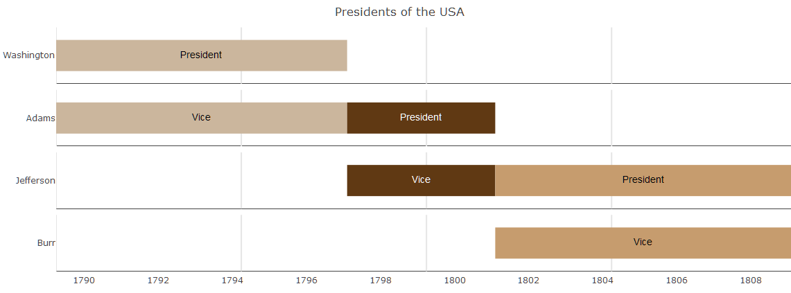
data <- read.csv(text="event,group,start,end,color
                       Phase 1,Project,2016-12-22,2016-12-23,#c8e6c9
                       Phase 2,Project,2016-12-23,2016-12-29,#a5d6a7
                       Phase 3,Project,2016-12-29,2017-01-06,#fb8c00
                       Phase 4,Project,2017-01-06,2017-02-02,#DD4B39
                       Room 334,Team 1,2016-12-22,2016-12-28,#DEEBF7
                       Room 335,Team 1,2016-12-28,2017-01-05,#C6DBEF
                       Room 335,Team 1,2017-01-05,2017-01-23,#9ECAE1
                       Group 1,Team 2,2016-12-22,2016-12-28,#E5F5E0
                       Group 2,Team 2,2016-12-28,2017-01-23,#C7E9C0
                       3-200,category 1,2016-12-25,2016-12-25,#1565c0
                       3-330,category 1,2016-12-25,2016-12-25,#1565c0
                       3-223,category 1,2016-12-28,2016-12-28,#1565c0
                       3-225,category 1,2016-12-28,2016-12-28,#1565c0
                       3-226,category 1,2016-12-28,2016-12-28,#1565c0
                       3-226,category 1,2017-01-19,2017-01-19,#1565c0
                       3-330,category 1,2017-01-19,2017-01-19,#1565c0
                       1-217.0,category 2,2016-12-27,2016-12-27,#90caf9
                       4-399.7,moon rising,2017-01-13,2017-01-13,#f44336
                       8-831.0,sundowner drink,2017-01-17,2017-01-17,#8d6e63
                       9-984.1,birthday party,2016-12-22,2016-12-22,#90a4ae
                       F01.9,Meetings,2016-12-26,2016-12-26,#e8a735
                       Z71,Meetings,2017-01-12,2017-01-12,#e8a735
                       B95.7,Meetings,2017-01-15,2017-01-15,#e8a735
                       T82.7,Meetings,2017-01-15,2017-01-15,#e8a735")

vistime(data)      # the Plotly version
# hc_vistime(data) # Alternative for Highcharts
# gg_vistime(data) # Alternative for ggplot2
The argument optimize_y can be used to change the look of the timeline. TRUE (the default) will find a nice heuristic to save y-space, distributing the events:
data <- read.csv(text="event,start,end
                       Phase 1,2020-12-15,2020-12-24
                       Phase 2,2020-12-23,2020-12-29
                       Phase 3,2020-12-28,2021-01-06
                       Phase 4,2021-01-06,2021-02-02")

vistime(data, optimize_y = TRUE)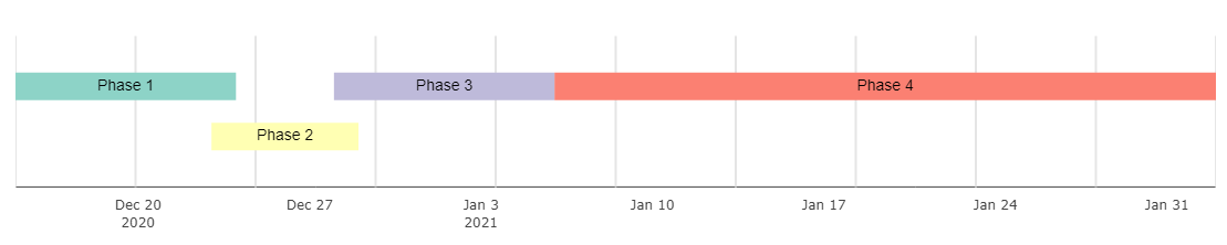
FALSE will plot events as-is, not saving any space:
vistime(data, optimize_y = FALSE)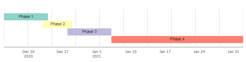
Once created, you can use plotly::export() for saving your vistime chart (the plotly version) as PDF, PNG or JPEG:
# webshot::install_phantomjs()
chart <- vistime(pres, events="Position")
plotly::export(chart, file = "presidents.pdf")
Note that export requires the webshot package and additional arguments like width or height can be used (?webshot for the details). You can also download the plot as PNG by using the toolbar on the upper right side of the generated plot.
vistime() objects can be integrated into Shiny via plotlyOutput() and renderPlotly()hc_vistime() objects can be integrated into Shiny via highchartOutput() and renderHighchart()gg_vistime() objects can be integrated into Shiny via plotOutput() and renderPlot()library(shiny)
library(plotly)
library(vistime)
pres <- data.frame(Position = rep(c("President", "Vice"), each = 3),
Name = c("Washington", rep(c("Adams", "Jefferson"), 2), "Burr"),
start = c("1789-03-29", "1797-02-03", "1801-02-03"),
end = c("1797-02-03", "1801-02-03", "1809-02-03"),
color = c('#cbb69d', '#603913', '#c69c6e'),
fontcolor = c("black", "white", "black"))
shinyApp(
ui = plotlyOutput("myVistime"),
server = function(input, output) {
output$myVistime <- renderPlotly({
vistime(pres, col.event = "Position", col.group = "Name")
})
}
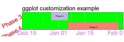
)ggplot2::theme() for gg_vistime chartsSince every gg_vistime output is a ggplot object, you can customize and override literally everything:
data <- read.csv(text="event,start,end
                       Phase 1,2020-12-15,2020-12-24
                       Phase 2,2020-12-23,2020-12-29
                       Phase 3,2020-12-28,2021-01-06
                       Phase 4,2021-01-06,2021-02-02")

p <- gg_vistime(data, optimize_y = T, col.group = "event", title = "ggplot customization example")

library(ggplot2)
p + theme(
      plot.title = element_text(hjust = 0, size=30),
      axis.text.x = element_text(size = 30, color = "violet"),
      axis.text.y = element_text(size = 30, color = "red", angle = 30),
      panel.border = element_rect(linetype = "dashed", fill=NA),
      panel.background = element_rect(fill = 'green')) +
    coord_cartesian(ylim = c(0.7, 3.5))
See ?ggplot2::theme for details.
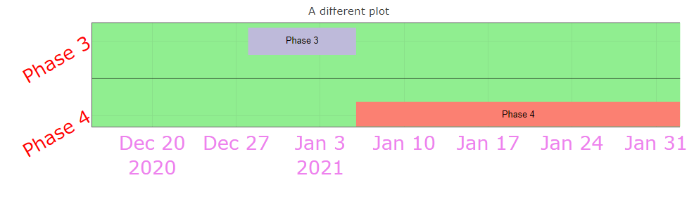
plotly::layout() for vistime chartslibrary(plotly)
p2 <- vistime(data, optimize_y = T, col.group = "event", title = "plotly customization example")
p2 %>% layout(xaxis=list(fixedrange=TRUE, tickfont=list(size=30, color="violet")),
yaxis=list(fixedrange=TRUE, tickfont=list(size=30, color="red"), tickangle=30,
mirror = FALSE, range = c(0.7, 3.5), showgrid = T),
plot_bgcolor = "lightgreen")See ?plotly::layout and the official Plotly API reference for details.
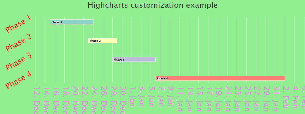
highcharter::hc_*() for hc_vistime chartslibrary(highcharter)
p3 <- hc_vistime(data, optimize_y = T, col.group = "event", title = "Highcharts customization example")
p3 %>% hc_title(style = list(fontSize=30)) %>%
hc_yAxis(labels = list(style = list(fontSize=30, color="violet"))) %>%
hc_xAxis(labels = list(style = list(fontSize=30, color="red"), rotation=30)) %>%
hc_chart(backgroundColor = "lightgreen")See ?hc_xAxis, ?hc_chart and the official Highcharts API reference for details.
plotly::plotly_build() for vistime chartsThe function plotly_build() from package plotly turns your plot into a list. You can then use the function str to explore the structure of your plot. You can even manipulate all the elements there.
The key is to first create a simple Plotly example yourself, turning it into a list (using plotly_build()) and exploring the resulting list regarding the naming of the relevant attributes. Then manipulate or create them in your vistime example accordingly. Below are some examples of common solutions.
The following example creates the presidents example and manipulates the font size of the x axis ticks:
pres <- data.frame(Position = rep(c("President", "Vice"), each = 3),
                   Name = c("Washington", rep(c("Adams", "Jefferson"), 2), "Burr"),
                   start = c("1789-03-29", "1797-02-03", "1801-02-03"),
                   end = c("1797-02-03", "1801-02-03", "1809-02-03"),
                   color = c('#cbb69d', '#603913', '#c69c6e'),
                   fontcolor = c("black", "white", "black"))

p <- vistime(pres, col.event = "Position", col.group = "Name", title = "Presidents of the USA")

# step 1: transform into a list
library(plotly)
pp <- plotly_build(p)

# step 2: change the font size
pp$x$layout$xaxis$tickfont <- list(size = 28)

pp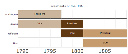
We need to change the font size of the y-axis:
pp$x$layout[["yaxis"]]$tickfont <- list(size = 28)

pp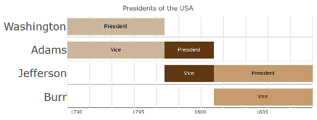
The following example creates the presidents example and manipulates the font size of the events:
pres <- data.frame(Position = rep(c("President", "Vice"), each = 3),
                    Name = c("Washington", rep(c("Adams", "Jefferson"), 2), "Burr"),
                    start = c("1789-03-29", "1797-02-03", "1801-02-03"),
                    end = c("1797-02-03", "1801-02-03", "1809-02-03"),
                    color = c('#cbb69d', '#603913', '#c69c6e'),
                    fontcolor = c("black", "white", "black"))

p <- vistime(pres, col.event = "Position", col.group = "Name", title = "Presidents of the USA")

# step 1: transform into a list
library(plotly)
pp <- plotly_build(p)

# step 2: loop over pp$x$data, and change the font size of all text elements to 28
for(i in seq_len(length(pp$x$data))){
    if(pp$x$data[[i]]$mode == "text") pp$x$data[[i]]$textfont$size <- 28
}

pp

# or, using purrr:
# text_idx <- which(purrr::map_chr(pp$x$data, "mode") == "text")
# for(i in text_idx) pp$x$data[[i]]$textfont$size <- 28
# pp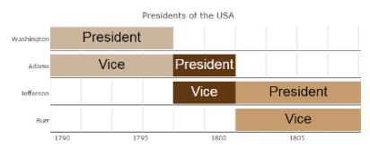
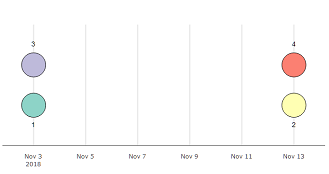
The following example a simple example using markers and manipulates the size of the markers:
dat <- data.frame(event = 1:4, start =  c("2019-01-01", "2019-01-10"))

p <- vistime(dat)

# step 1: transform into a list
library(plotly)
pp <- plotly_build(p)

# step 2: loop over pp$x$data, and change the marker size of all text elements to 50px
for(i in seq_len(length(pp$x$data)){
    if(pp$x$data[[i]]$mode == "markers") pp$x$data[[i]]$marker$size <- 10
}

pp

# or, using purrr:
# marker_idx <- which(purrr::map_chr(pp$x$data, "mode") == "markers")
# for(i in marker_idx) pp$x$data[[i]]$marker$size <- 10
# pp