![]()
This package includes a few functions to plot and help understand Positive and Negative Predictive Values, and their relationship with Sensitivity, Specificity and Prevalence.
The BayesianReasoning package has three main functions:
You can install the stable (CRAN) version of the package with install.packages("BayesianReasoning") or development version with remotes::install_github("gorkang/BayesianReasoning@dev"). Please report any problems you find in the Issues Github page.
There is a shiny app implementation with most of the main features of the PPV_heatmap() function available.
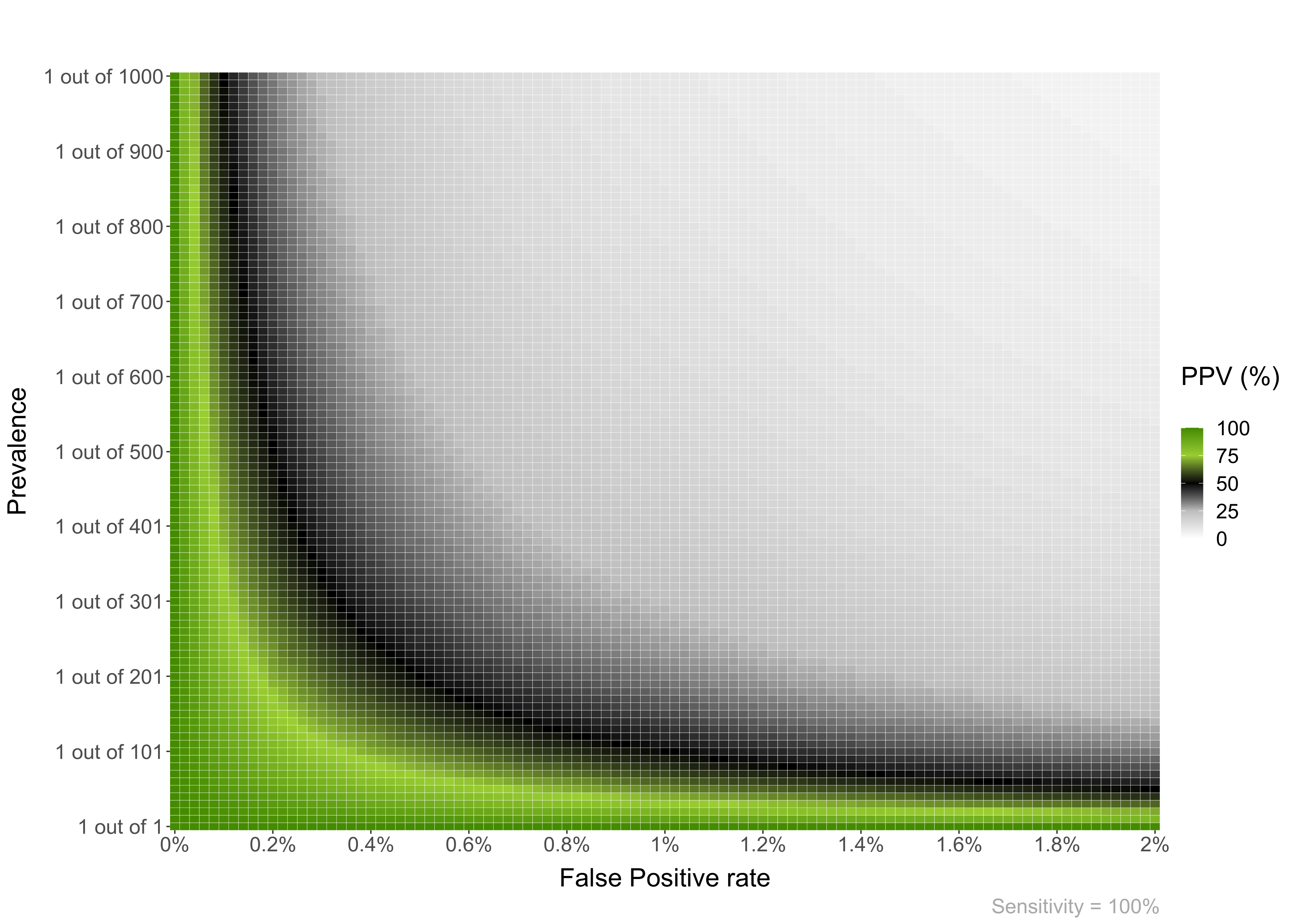
Plot heatmaps with PPV or NPV values for a given specificity and a range of Prevalences and FP or FN (1 - Sensitivity). The basic parameters are:
PPV_heatmap(Min_Prevalence = 1,
            Max_Prevalence = 1000,
            Sensitivity = 100,
            Max_FP = 2,
            Language = "en")
You can also plot an NPV heatmap with PPV_NPV = “NPV”.
PPV_heatmap(PPV_NPV = "NPV",
            Min_Prevalence = 800,
            Max_Prevalence = 1000,
            Sensitivity = 80,
            Max_FP = 5,
            Language = "en")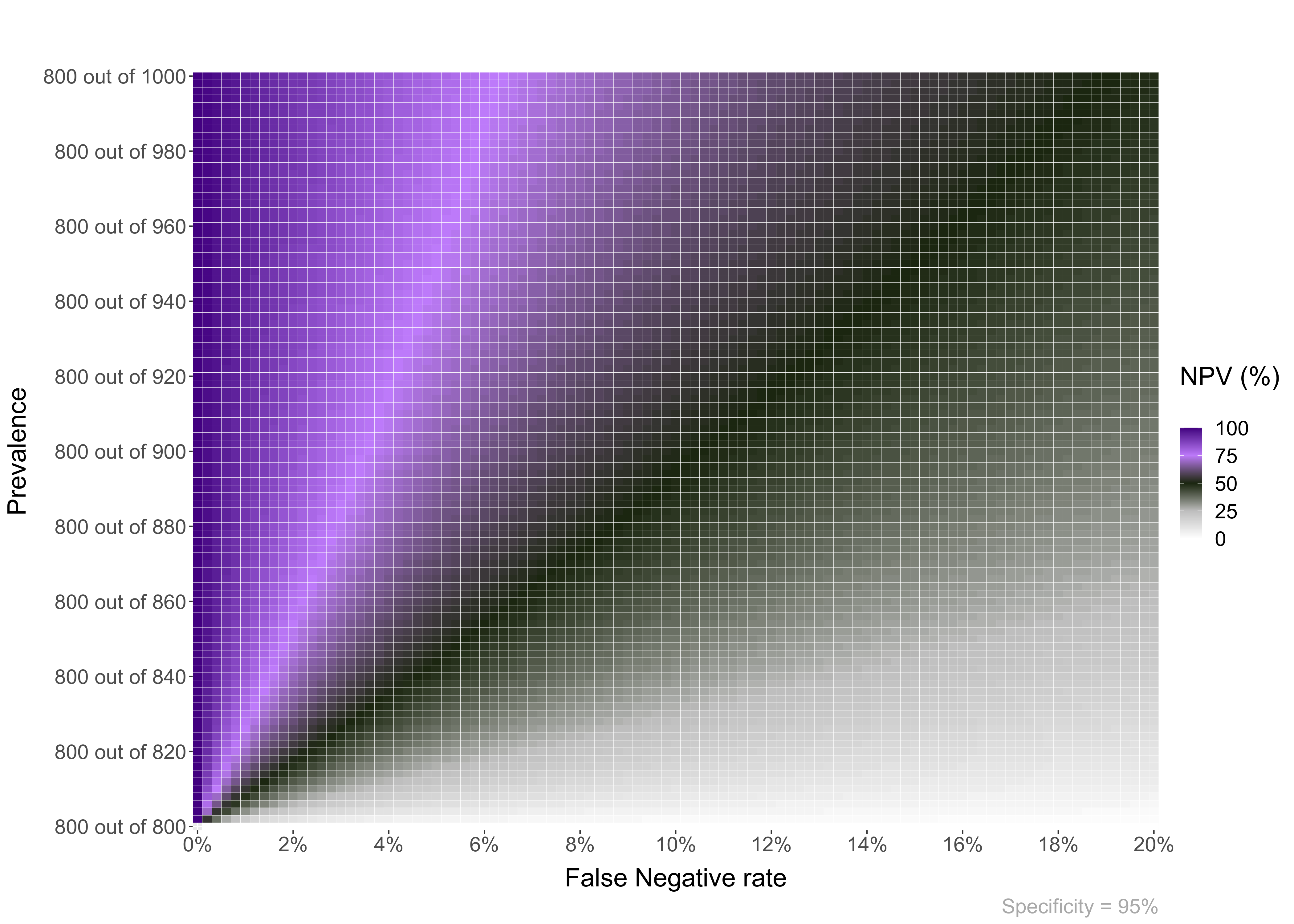
You can add different types of overlay to the plots.
For example, an area overlay showing the point PPV for a given prevalence and FP or FN:
PPV_heatmap(Min_Prevalence = 1, Max_Prevalence = 1200, Sensitivity = 81, Max_FP = 5,
            label_subtitle = "Prenatal screening for Down Syndrome by Age",
            folder = "",
            overlay = "area",
            overlay_labels = "40 y.o.",
            overlay_position_FP = 4.8,
            overlay_prevalence_1 = 1,
            overlay_prevalence_2 = 68)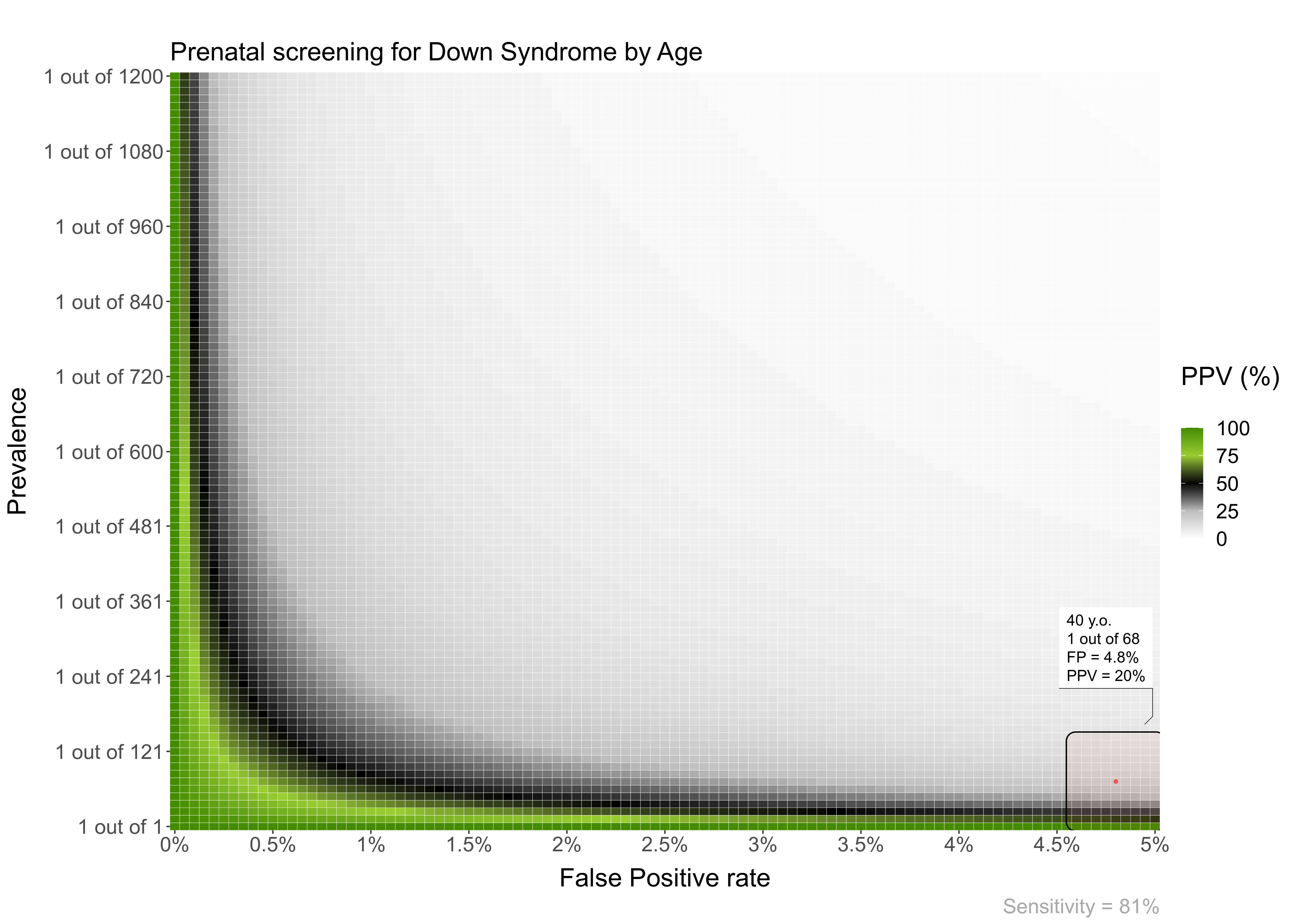
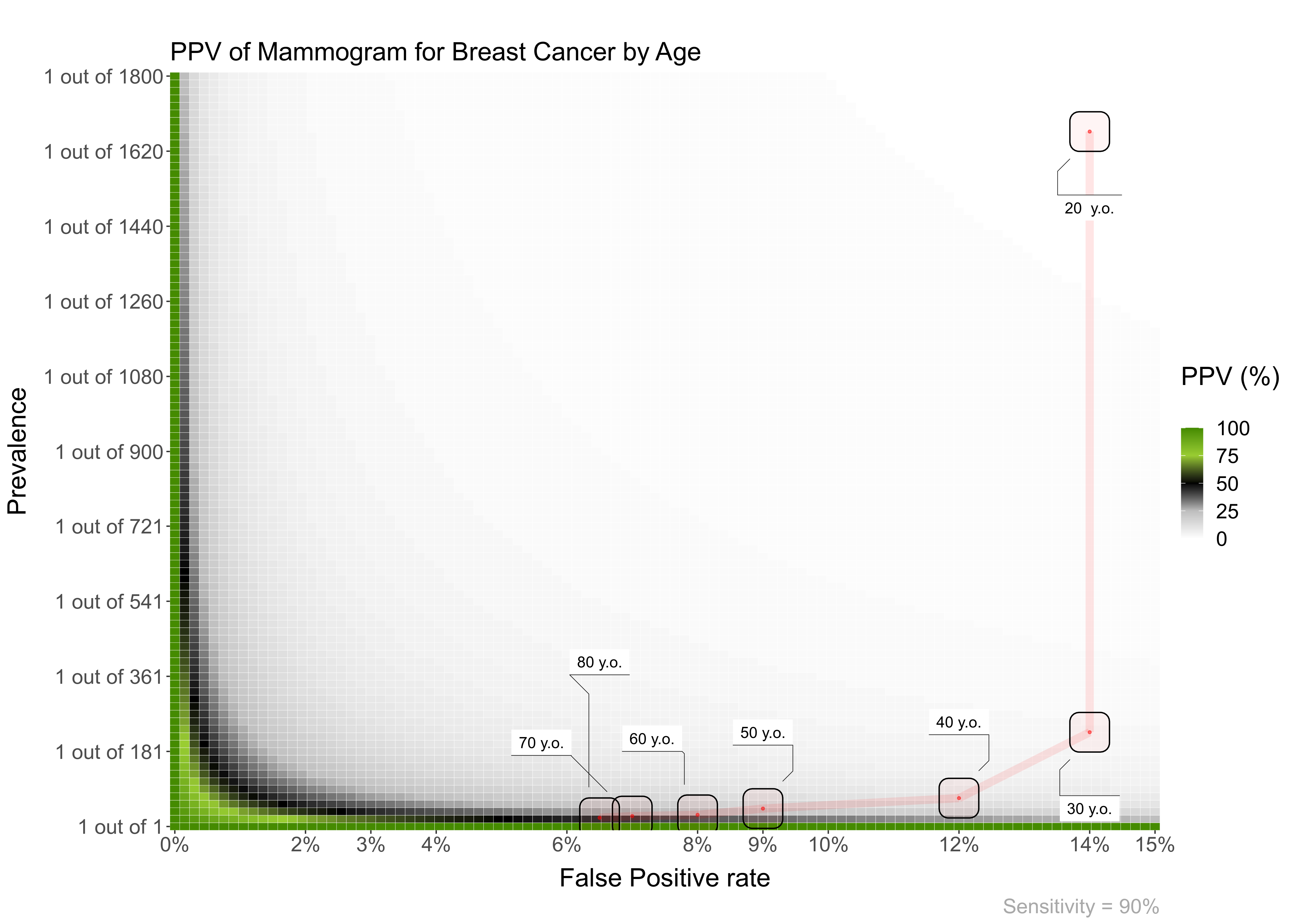
Also, you can add a line overlay highlighting a range of prevalences and FP. This is useful, for example, to show how the PPV of a test changes with age:
PPV_heatmap(Min_Prevalence = 1, Max_Prevalence = 1800, Sensitivity = 90, Max_FP = 15,
            label_subtitle = "PPV of Mammogram for Breast Cancer by Age",
            overlay = "line",
            overlay_labels = c("80 y.o.", "70 y.o.", "60 y.o.", "50 y.o.", "40 y.o.", "30 y.o.", "20  y.o."),
            overlay_position_FP = c(6.5, 7, 8, 9, 12, 14, 14),
            overlay_prevalence_1 = c(1, 1, 1, 1, 1, 1, 1),
            overlay_prevalence_2 = c(22, 26, 29, 44, 69, 227, 1667))
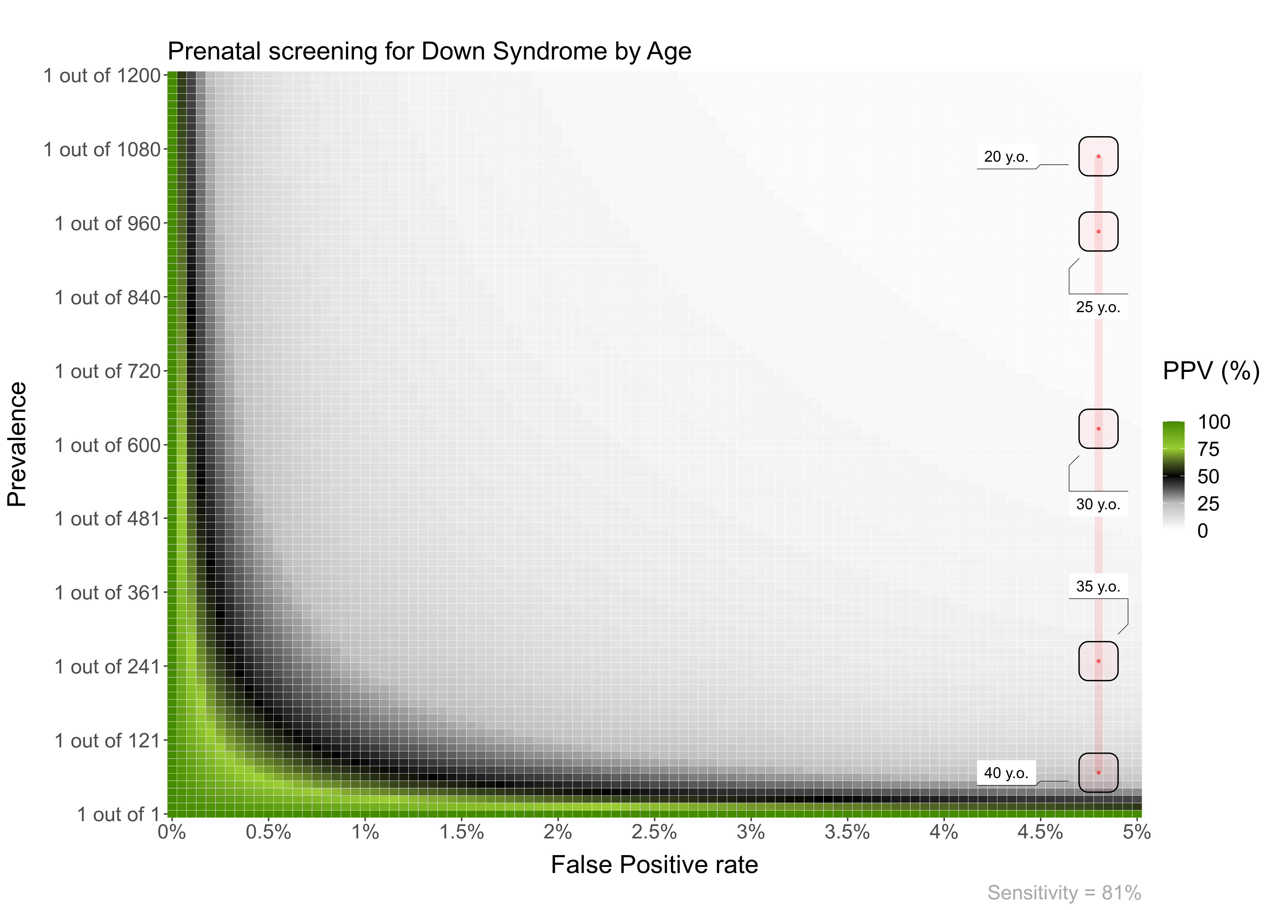
Another example. In this case, the FP is constant across age:
PPV_heatmap(Min_Prevalence = 1, Max_Prevalence = 1200, Sensitivity = 81, Max_FP = 5,
            label_subtitle = "Prenatal screening for Down Syndrome by Age",
            overlay = "line",
            overlay_labels = c("40 y.o.", "35 y.o.", "30 y.o.", "25 y.o.", "20 y.o."),
            overlay_position_FP = c(4.8, 4.8, 4.8, 4.8, 4.8),
            overlay_prevalence_1 = c(1, 1, 1, 1, 1),
            overlay_prevalence_2 = c(68, 249, 626, 946, 1068))
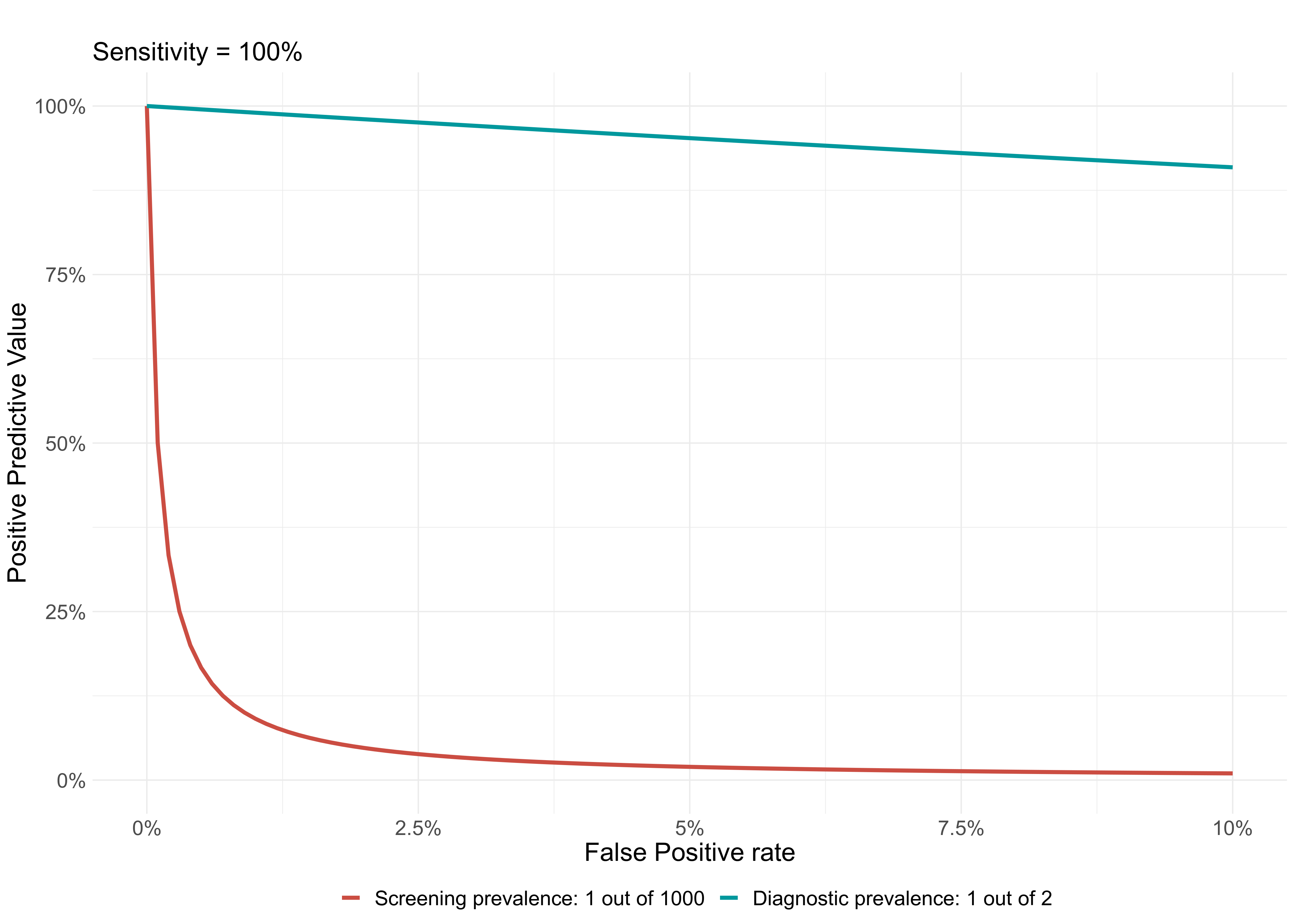
In scientific studies developing a new test for the early detection of a medical condition, it is quite common to use a sample where 50% of participants has a medical condition and the other 50% are normal controls. This has the unintended effect of maximizing the PPV of the test.
This function shows a plot with the difference between the PPV of a diagnostic context (very high prevalence; or a common study sample, e.g. ~50% prevalence) versus that of a screening context (lower prevalence).
PPV_diagnostic_vs_screening(Max_FP = 10,
                            Sensitivity = 100,
                            prevalence_screening_group = 1000,
                            prevalence_diagnostic_group = 2)
Imagine you would like to use a test in a population and want to have a 98% PPV. That is, IF a positive result comes out in the test, you would like a 98% certainty that it is a true positive.
How high should the prevalence of the disease be in that group?
To reach a PPV of 98 when using a test with 100 % Sensitivity and 0.1 % False Positive Rate, you need a prevalence of at least 1 out of 21
Another example, with a very good test, and lower expectations:
To reach a PPV of 70 when using a test with 99.9 % Sensitivity and 0.1 % False Positive Rate, you need a prevalence of at least 1 out of 429